0 Comments
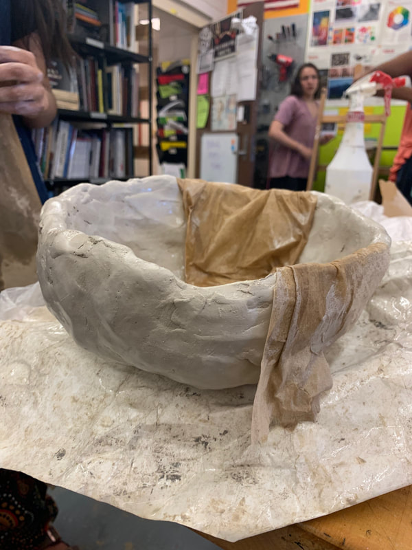
I haven't made a lot of process at all in the past few days because I've been out sick, but last class I was trying to decide if I wanted to have texture on the shape. I tried to make a geometric design but it didn't work at all and also tried paddling which I liked, but I didn't like its randomness. Finally, I just went back with a smooth metal rib and tried to smooth it the best I could. I am planning on carving in the countries next class and then hopefully putting the two pieces together. Last class, I decided that I wanted to have my sculpture on top of something so that the pieces of wire can fully encompass the entire thing. Mrs. Mosley found a piece of wood for me to place it on, and I'm content with that currently. I may alter it slightly but idk yet :P. I need to take a picture and overall, I feel really behind on this project, but I'm confident that it will all come together in the end.
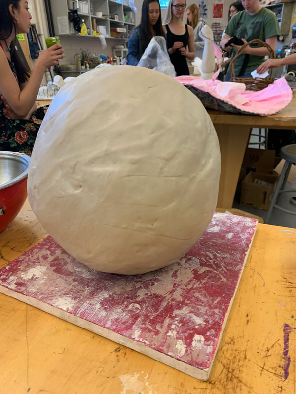
This project is off to an interesting start. I discussed the shape of my sculpture with Mrs. Mosley some more and decided that I do indeed want to have an organic shape in clay with a cutout of India somewhere. If I do it at the top, then it will have the look of being a cracked egg until someone realizes otherwise. If I have the India carved into the side, then I am planning on sketching in other country’s very lightly and playing with underglazes in order to make it into something like a globe. Instead of using the wheel, I’m going to work my clay piece up into the round shape that I want it without using coils because I want the unfinished feeling that ‘the world isn’t perfect.’ I also plan on having wires coming out my my piece and connecting them to other countries to make it seem like flights. The content behind this is that all 3rd world countries are seemingly small and weak, but they support each other and are united in more ways than they like to admit. So, far I have only begun to work the clay and I admit that it isn’t easy. I’m going to work on it a lot more during break and I need to find a way to keep the moisture inside it so that it is still workable :).
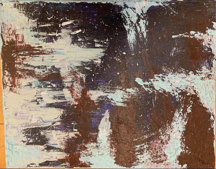
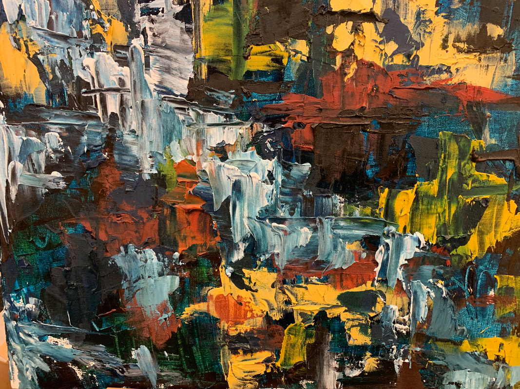
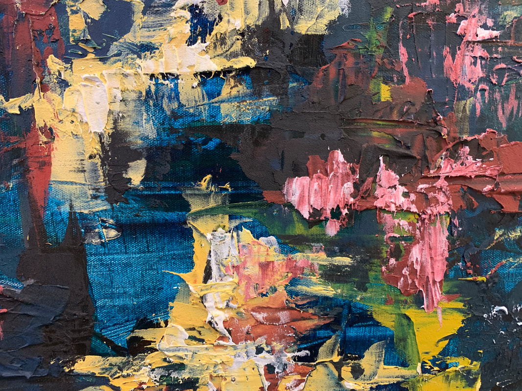
Finished Piece: murky waters and sunny days.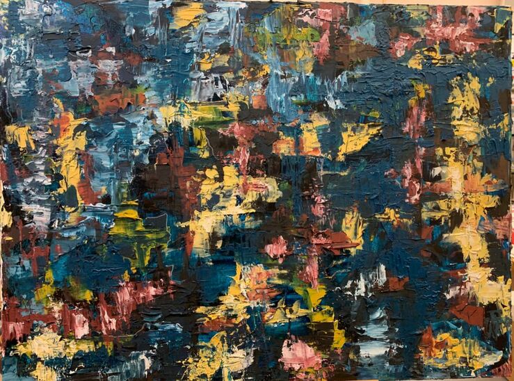
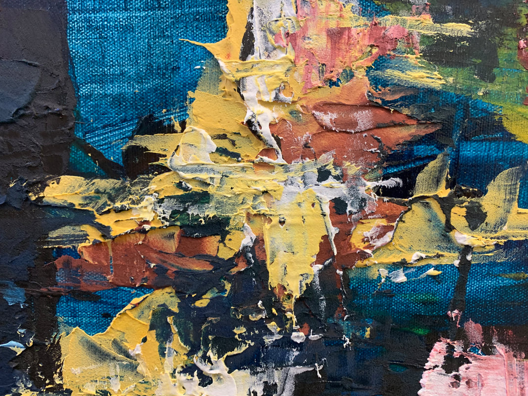
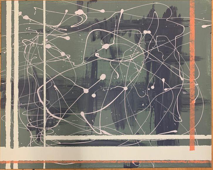
Both of my practice paintings affected my final painting and my next abstract expressionist piece as well. Since these were experimental, instead of worrying about the outcome, I flung colors onto the canvas and decided whether I liked the composition, texture, or ~feel~ of the stroke. The first painting shows a more free, all over composition with a palette knife and the mixing of colors on the canvas itself. I feel as though I incorporated this painting, because I would often overlap colors while they were still wet on the canvas to create a more complex piece. I also learned about how to use layers when creating these practice paintings. Obviously, my final painting required many different layers, and I understood the difference of layering texture on top of texture as well as the dryness of the paint underneath that affects the top layer. My second practice painting didn't influence my final as much as the first, but I did learn the interesting technique of zipping. The scribbles of white paint was also very different for me, because I generally stick to bold strokes of color which is directly behind it. However, I did use that free motion of my hand during my final piece which really does express my expression that I had for my piece. I loved doing the little paintings, and I liked them before I started working on my actual painting (and soon realized they're puny and kind of ugly), but I value the learning experience they offered.
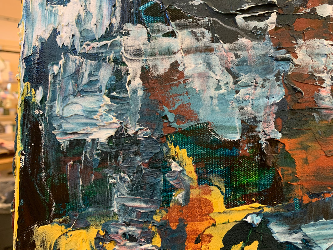
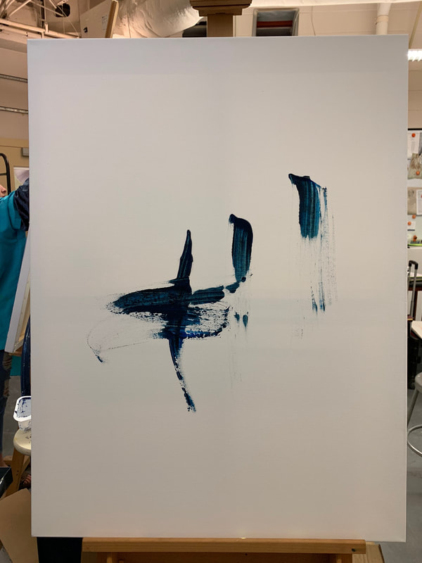
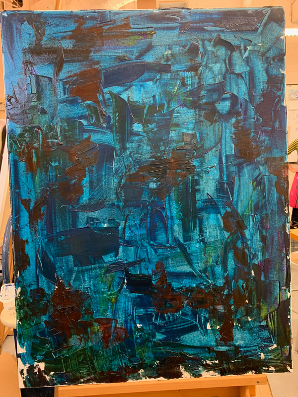
Hmmmm, I like the base color and I LOVE the first strokes that I put on the canvas, because the color looked beautiful and it seemed very dynamic (reminded me a bit of Post Malone's album cover for Wow). As I developed the base layer, I really liked the way the palette knife applied the color, but then I realized that I needed another color to make it more interesting, and applied green and dark red. The dark red makes me uncomfortable so I think I'm going to apply black on top of it next class, and then develop the colors from there. I'm going for a Hans Hofmann style without the big blocks for this painting and my color scheme will most likely be: phthalo blue, dark red, light yellow, mustard yellow, and slightly desaturated red. :) yayy!
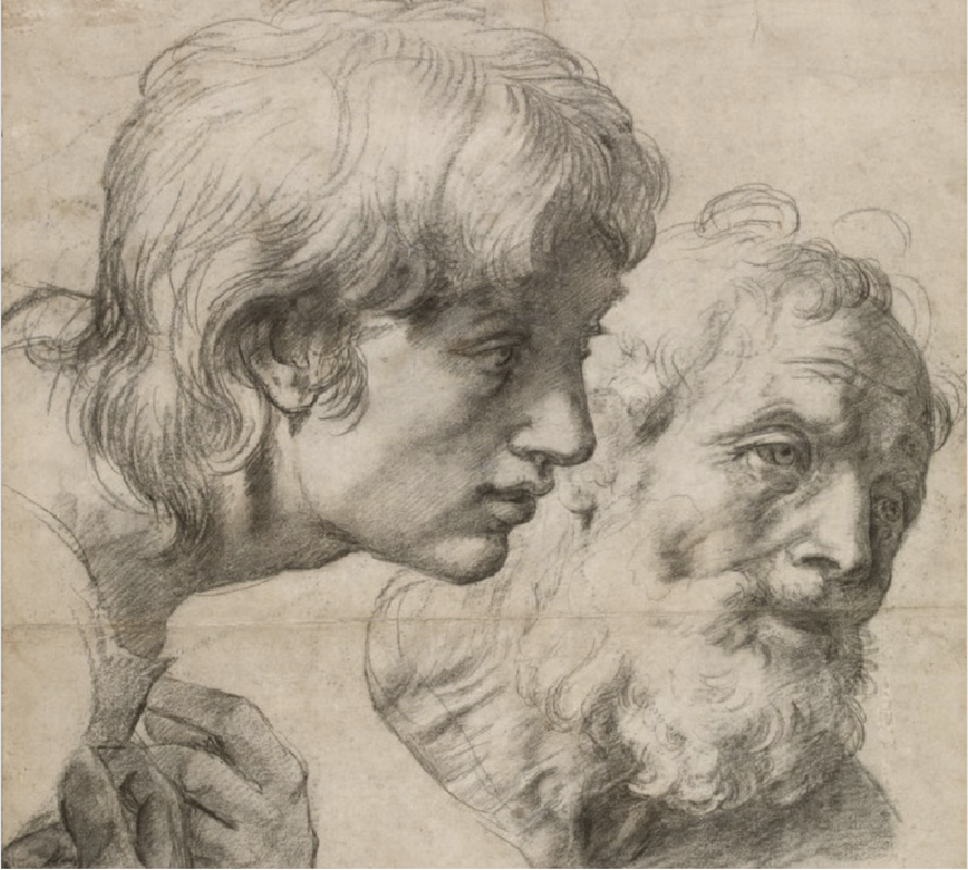
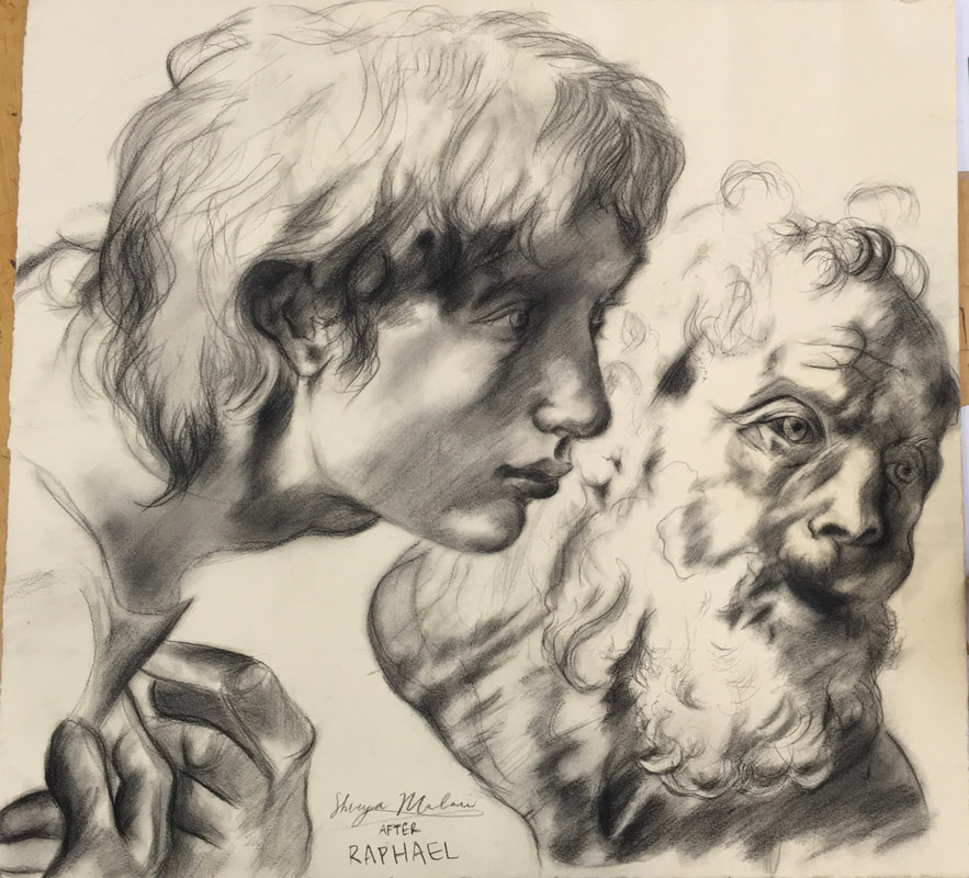
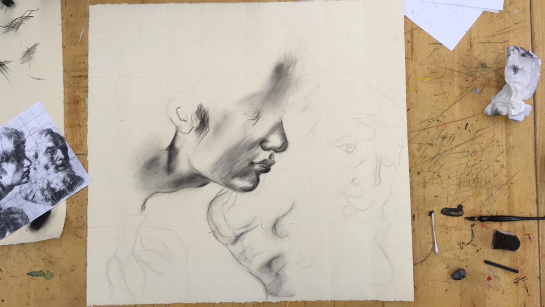
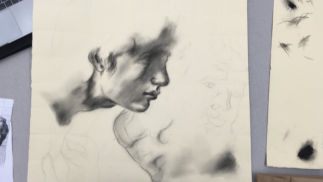
Eek... I'm not really happy with my self-portrait at all. It's ok because I learned a LOT from this project, but I really wished I had a better outcome because I quite enjoyed the process. While I was sketching my face, I had trouble crating my features properly because I didn't exactly know the exact shape of my nose or eyes and it's a lot easier to draw someone else's face, because you don't care about their features. However, with this project, I was forced to acknowledge the shape of all my features which was quite interesting. I wish I had a re-do with this project because I would do a lot of things different, including keeping with the grid lines better, not doing a picture with my tongue in it, putting my hash marks in different places, and adding something to the background, and redoing my nose because it looks really weird in my drawing right now. I enjoyed using Raphael's mark with the hash marks and although it took a really long time since they are such skinny lines and so close together, I was quite content with the overall look of it. This project was really fun and although I really don't like the outcome, I know that I will use what I learned during it in the future.
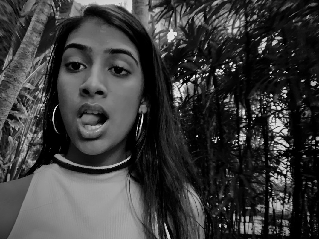
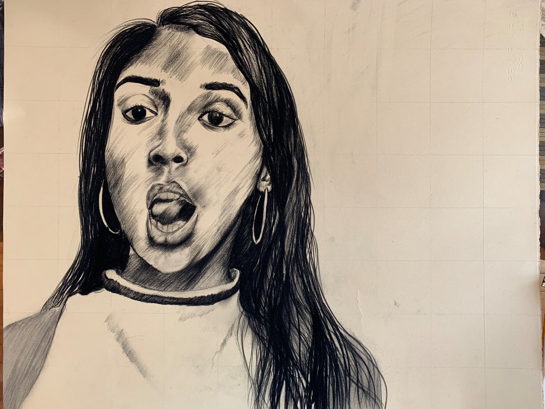 I finished!! Almost... I still need to erase the grid and decide what to do with the background and fix up the shirt and maybe work some more on my eyes and tongue (which I literally despise.), but I am pleased with how it came together. I kind of liked it more before I did the hair and the mouth, but I had to do it eventually. Working with Raphael's mark was so difficult for me because I love to smudge and just press hard with the charcoal and conte, but I had to restrain myself because Raphael made hatch marks in one direction. I have so much more respect for hatch marks now, and I will most likely try it again in the future, but with more of my style mixed in. I wish I had chosen a picture with my mouth closed because the teeth and tongue were so difficult to do, especially because I looked VERY strange with the teeth actually defined. Its alright, I'm finished and I don't hate it... This is the image I've chose to as my reference photo for this self portrait. I am slightly worried that this doesn't have enough shadows in the image, but I have decided to use line quality and make the my face more dramatic than it is in the photo. I am very unsure about what to do for the background, but I am hoping to make it messy like Raphael's study with small marks here and there to make it a not as finished look. I also am not looking forward to creating the features of my face, because I'm scared that I'm going to fix what I don't like about the photo as I go along :P. Lastly, I I am concerned about the direction that the shadows are falling on my face and in which way I am going to make my lines because on my old master, I made all of my lines in on each face in one direction to have a sense of unity and continuity.
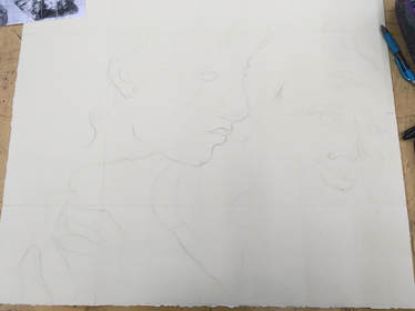
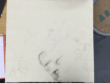
So far, I have edited my photo and started on the grid and drawing of the sketch which I will upload a little later :). I should have updated my progress earlier, but it's ok because I am not super far in the progress. I am copying the Old Master Raphael's study of the two heads of Apostles. This work is in black chalk and I didn't choose the right paper so it has a little too much tooth for black chalk, but I don't hate the texture that is showing. Also, I found out that it is really hard to work with black chalk because the marks have to all be really skinny and little in order to create a smooth shadow or shape. Raphael's marks are interesting to replicate, however, because since it was a drawing or compositional sketch, I can see where Raphael tried to find the shape of the head using different lines and shapes. I also love how this is not really a finished piece, so it is more just shadows and shapes on the page instead of tedious lines in the perfect places. I don't really like the placing of my eye or the proportion of my nose because I feel like both were differently placed on the original, but my friends and Mrs. Mosley told me it was fine. I also slightly changed the curve of the chin as well as the type of chalk that I was using. You can see that the first marks that I placed were different from the ones that I used on the figure on the left. Hopefully, this piece turns out ok because I really love the Old Master drawing. :) I'll update you soon on the finishing touches,
|
Authormy name is shreya. Archives
June 2021
Categories |


 RSS Feed
