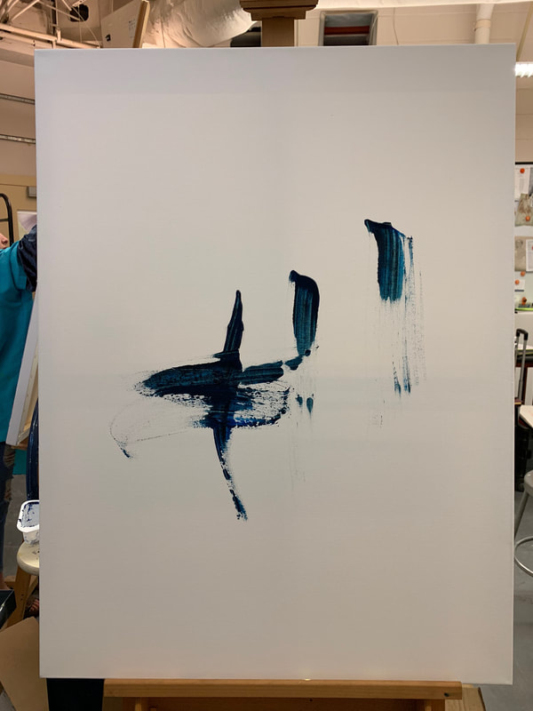
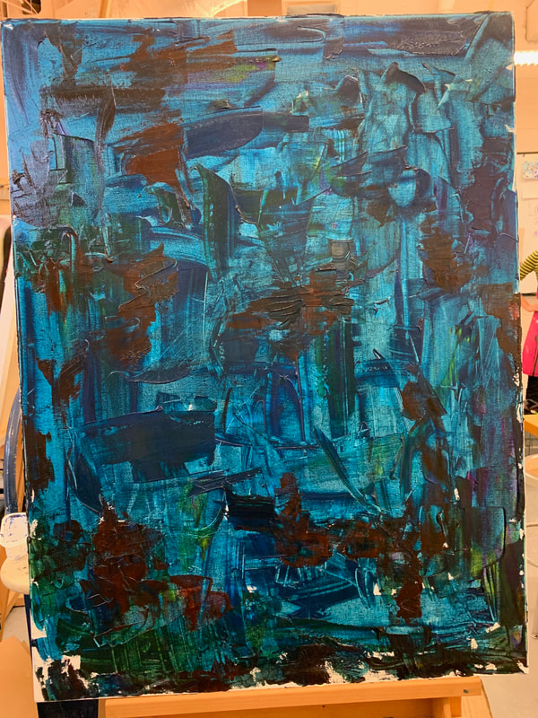
Hmmmm, I like the base color and I LOVE the first strokes that I put on the canvas, because the color looked beautiful and it seemed very dynamic (reminded me a bit of Post Malone's album cover for Wow). As I developed the base layer, I really liked the way the palette knife applied the color, but then I realized that I needed another color to make it more interesting, and applied green and dark red. The dark red makes me uncomfortable so I think I'm going to apply black on top of it next class, and then develop the colors from there. I'm going for a Hans Hofmann style without the big blocks for this painting and my color scheme will most likely be: phthalo blue, dark red, light yellow, mustard yellow, and slightly desaturated red. :) yayy!
0 Comments
Leave a Reply. |
Authormy name is shreya. Archives
June 2021
Categories |
 RSS Feed
